
Designing a Better Brand for Better Rhodes
Unifying a brand experience built on joy, trust, and belonging

When I first began working with the founders of Better Rhodes, they had already built something remarkable. The company had become a trusted name in the non-alcoholic beverage space, serving as both a marketplace and a source of education for people exploring a new kind of drinking culture. But as their reach expanded, so did their portfolio. They had introduced AF Radio and the Better Without App, and were beginning to look toward new opportunities.
The challenge was clear. How do you unify multiple properties under a single, recognizable brand? How do you maintain consistency while allowing each platform to have its own personality and purpose? And most importantly, how do you ensure that the customer always remains at the center of the story?
That became our guiding question.
From Mission to Message
Better Rhodes’ mission has always been rooted in connection. The founders wanted to make discovering and enjoying non-alcoholic beverages easier, friendlier, and more inspiring for everyone. This was not a company built on exclusion or restriction, but on celebration and inclusion. The brand needed to feel welcoming, informed, and human.
My role was to take that mission and express it visually. Through a series of strategy sessions, I worked with the team to define what makes Better Rhodes different in a growing and competitive category. Together, we articulated a simple truth: the heart of Better Rhodes is its customers. Every product, podcast, and app exists to help people make better choices and feel good about them. The visual identity needed to reflect that philosophy.
Our goal was to translate a customer-focused mission into a customer-friendly identity.
Building Brand Consistency
At the time, each property of Better Rhodes—Marketplace, AF Radio, and Better Without—had its own visual language. While this independence allowed each to grow quickly, it also created a fragmented experience. To the customer, it wasn’t always obvious that these initiatives were connected, or that they all came from the same trusted source.
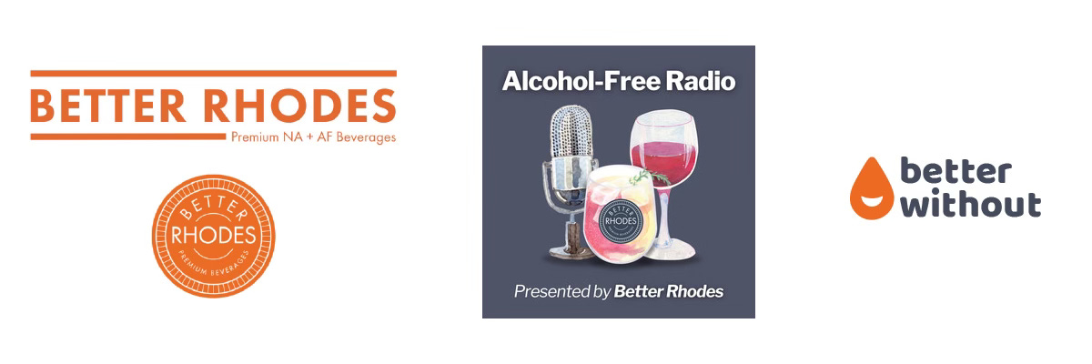
To solve this, we began with discovery. We mapped how customers interacted with each brand touchpoint, from the website and social media to product packaging and email communication. This process revealed opportunities to create a shared visual system that could scale.
We developed a comprehensive brand framework that brought unity and simplicity to everything the company touched. That meant consistent typography, a refined color palette, and an adaptable design grid that could support both the corporate and consumer-facing sides of the brand. Every decision was made with intention, ensuring the look and feel of Better Rhodes was consistent, confident, and familiar.
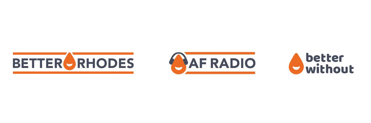
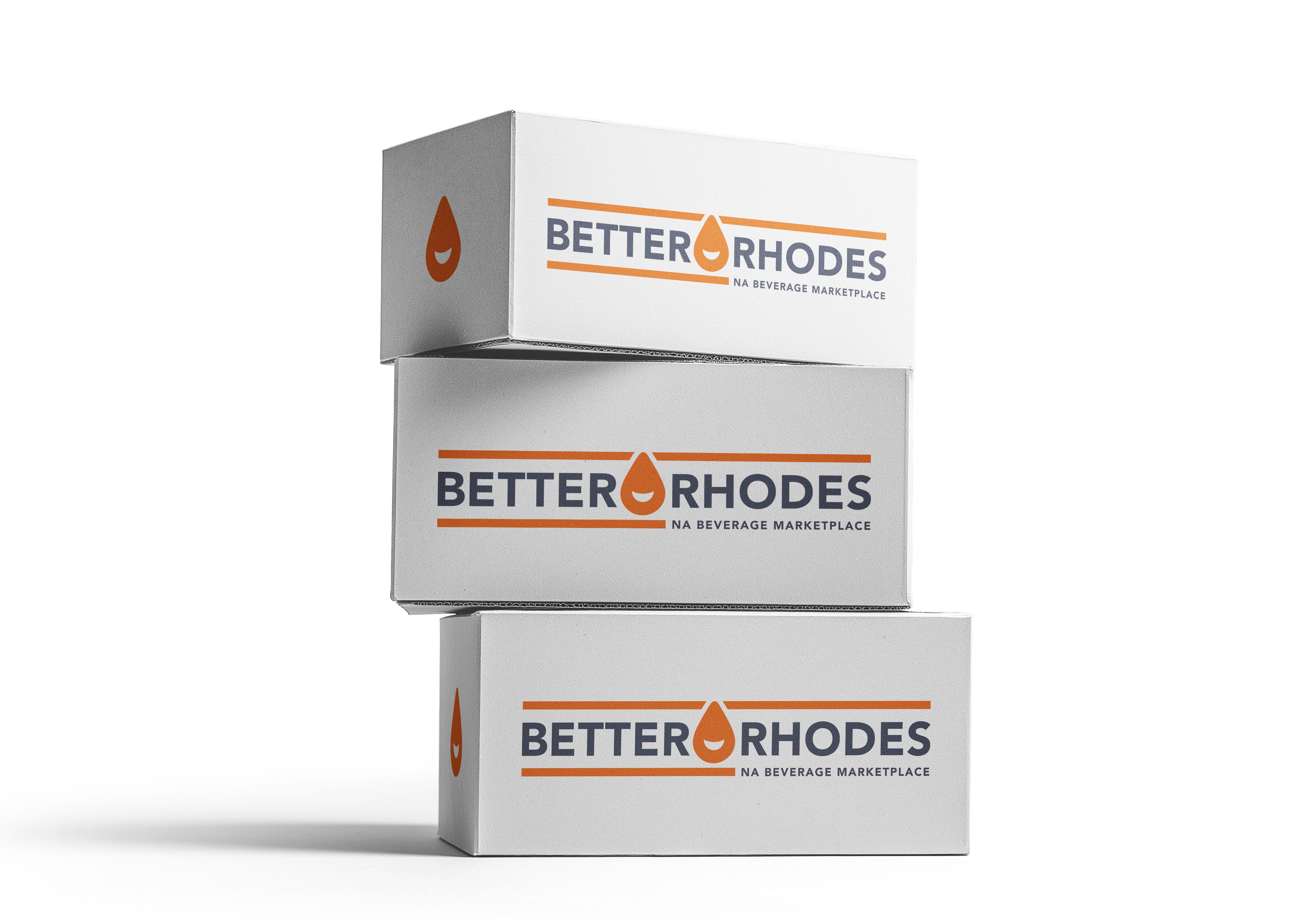
The Smile in the Drop
The most visible piece of this evolution is the new Better Rhodes logo. At its center is an orange drop containing a subtle smile—a simple symbol that conveys optimism, warmth, and trust. It also reflects the brand’s connection to the beverage world, without being overly literal or confined to a single category.
As CEO Daniel Stiller put it, “The logo just makes me smile.” That statement became the guiding principle for the entire project. We wanted the logo to capture the joy of discovering something better for yourself.
“The logo just makes me smile.”
Typography was refined for clarity and legibility, ensuring the logo works seamlessly across digital and physical applications. The colors were tuned for greater contrast and consistency, allowing the brand to stand out without losing its sense of approachability. In every execution, from app icons to podcast covers, the new identity maintains a sense of friendliness and confidence.
Design That Reflects Purpose
Ultimately, this was not simply a logo redesign. It was a strategic effort to bring clarity to a growing brand ecosystem and to ensure every touchpoint reinforces the same message. The work helped Better Rhodes unify its properties and present a cohesive story to the world—one that is informed, encouraging, and easy to recognize.
As a designer, I believe the best branding does more than make a company look good. It helps people understand who that company is, what it stands for, and why it matters. When design aligns with purpose, it becomes more than decoration. It becomes communication.
The Better Rhodes identity is more than a smile in a drop. It is the visual expression of a brand that leads with empathy, values its customers, and believes that making better choices should always feel good.
If you enjoyed this story, I invite you to subscribe to None for Me. It is where I share reflections on creativity, purpose, and building something meaningful, whether that is a business, a brand, or a better version of yourself. Each post is about choosing clarity over chaos and intention over impulse. Subscribe to join me on this journey of making better choices, one story at a time.